The Idea
Life around Karlaplan in Stockholm has a character all its own. A vibrant mix of generations coexists here. When we were tasked with updating Fältöversten’s visual identity, we began where everything starts – with the people. We observed, listened, and drew inspiration from the area’s unique rhythm. The result is a locally rooted identity: a visual world that captures the spirit of Karlaplan’s many characters. Tasteful and playful at the same time.
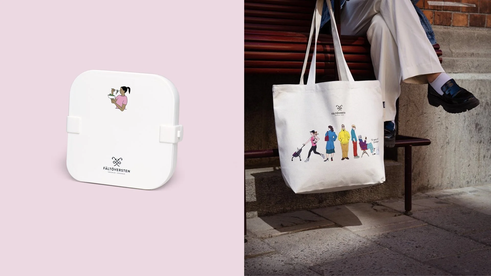
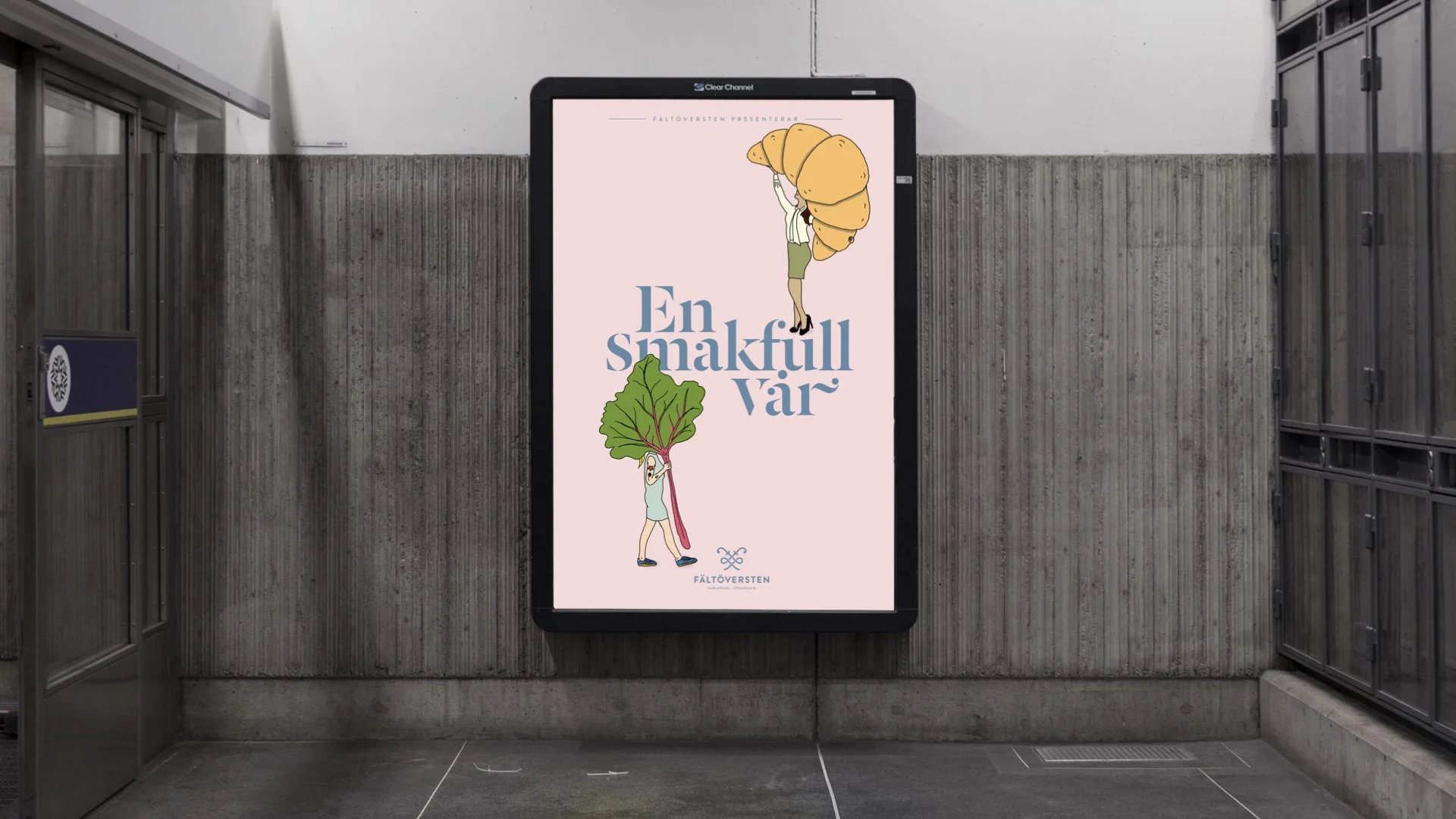
The illustrations, now a central design element, are taken directly from real life – eccentric ladies, sleek strollers, and oversized vegetables. The color palette still moves between light and dark contrasts, making it easy to adapt seasonally. The illustrations are allowed to be bold and vibrant, while the backgrounds remain understated and elegant. Just like Fältöversten itself: expressive yet refined.
The updated visual identity was created to live beyond the traditional – extending into everything from bags and coffee cups to lunch boxes, scarves, and even mustard. Everyday objects have become small works of art, offering something back to the customers and letting them carry a piece of Karlaplan with them.
And the new expression hasn’t just become part of daily life – it’s delivered real results. In less than six months, the number of customers who consider Fältöversten their first-choice shopping destination rose from 46 percent to 60 percent. The share of “brand lovers” increased from 29 to 34 percent, and those who feel at home at Fältöversten grew from 79 to 84 percent. When the refreshed identity was launched in communication, Fältöversten achieved its strongest results to date: a third of the target audience had seen the campaign, 81 percent correctly identified the sender, 42 percent liked it, and 30 percent said it made them more interested in visiting Fältöversten.